GNM Healthcare.
The corporate site of a group that reads physician conviction before it shows up in prescription data. A category to name, a locked palette, four languages.
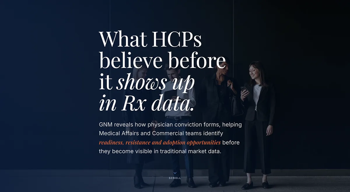
Overview
GNM Healthcare works with pharmaceutical companies on ground that prescription figures always describe too late: what clinicians search for, read, argue about and end up believing. Twenty years of scientific publishing, 1.2 million verified physicians, fifty independent clinical ecosystems.
The corporate site had to carry all of that — and first of all, name it. A WordPress theme cut by hand, scientific content driven by the client, four languages in the database. Live on 4 August 2026, in English first.
- Client
- GNM Healthcare, scientific intelligence and healthcare professional engagement
- Brief
- Rebuild the corporate site and name a market category
- Year
- 2026
- Role
- Design, custom theme, editorial back office, go-live
- Under the hood
- WordPress, ACF Pro, Polylang EN/FR/ES/JA, Playfair Display and Inter, Docker containers
Naming a category.
The client wasn’t selling a service. They were opening a category.
A corporate site that explains a familiar trade only has to say it well. This one had to make the case that a box was missing: prescription data reports what was done, surveys report what physicians are willing to say, education platforms report what was read. What was left — the place where conviction forms — nobody was measuring.
The name came before the home page: Conviction Intelligence. The whole architecture fell in behind it. The hero asks the question, the next section lines up the competing sources, and the fourth dimension of the work only arrives once the reader has accepted the first.
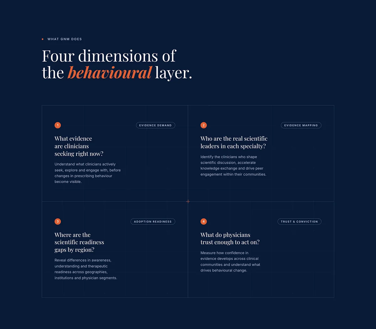
Four questions, four dimensions. The case is made without a single chart.
Navy, orange, nothing else.
A locked palette holds better than a thirty-page brand book.
Nine colours, two typefaces, one ornament. Navy carries the identity and covers nearly every surface; orange is the single accent, and it does exactly three jobs: the six-pixel round bullet that opens a kicker, the call-to-action button, and the one italic word a headline needs you to hear. Playfair Display for headings, Inter for body copy, an eight-point rhythm, no rounded corners on editorial media. The tokens are declared once, annotated “locked to the brand chart”, and the theme knows no others. It is a constraint the client can hold without me: nothing drifts when there is nothing to choose.
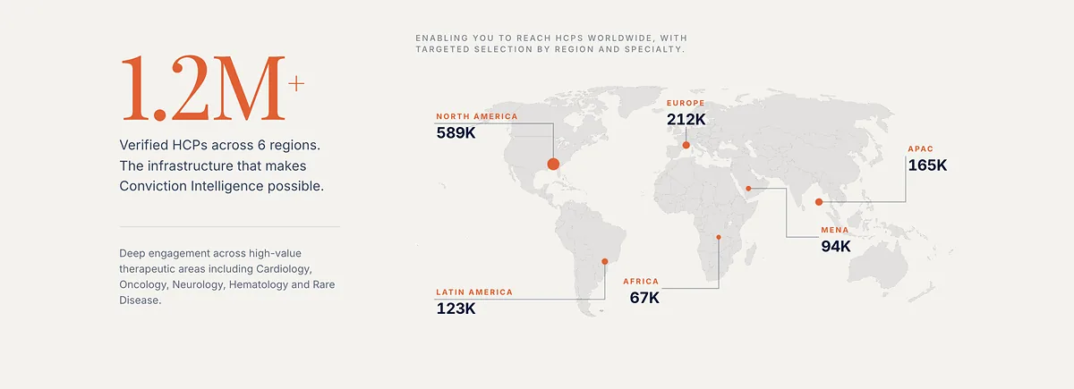
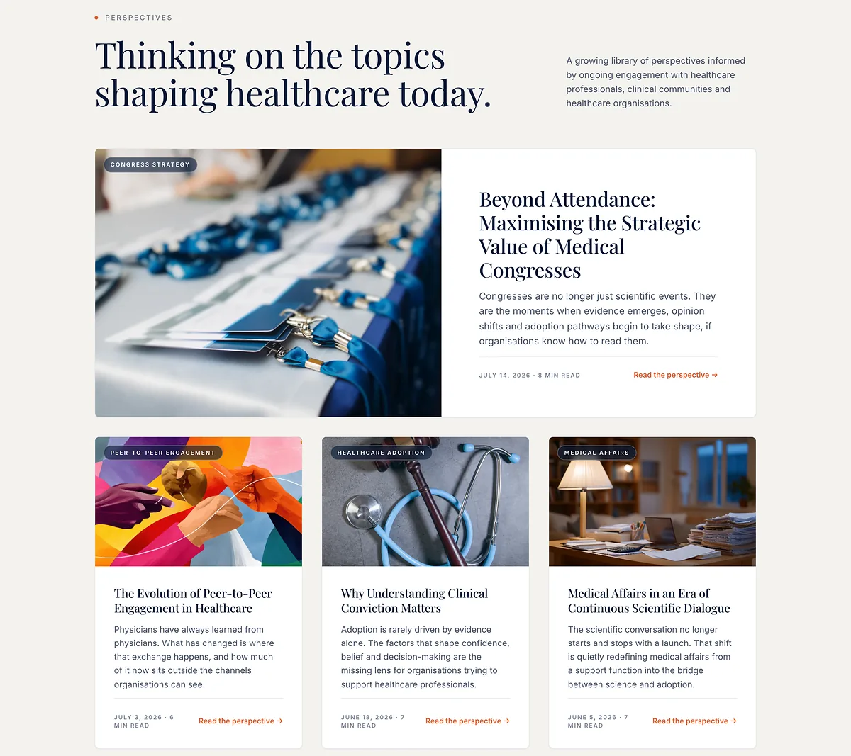

Screenshots of the live site, August 2026. The phone scrolls on its own.
Twenty areas, nothing hard-coded.
Scientific content moves at the pace of congresses, not at the pace of my deployments.
Cardiology, haematology, oncology, nephrology: twenty therapeutic areas, eighty sub-specialties, and for each one the patterns GNM’s teams observe in physician-to-physician exchange. None of it lives in the PHP. Every area, every count, every line of observation is a repeatable field the client opens, corrects and republishes on their own — so the day a medical director has the wording reviewed by their scientific committee, nobody is waiting on me. The templates carry defaults, never the truth: the database has the last word.
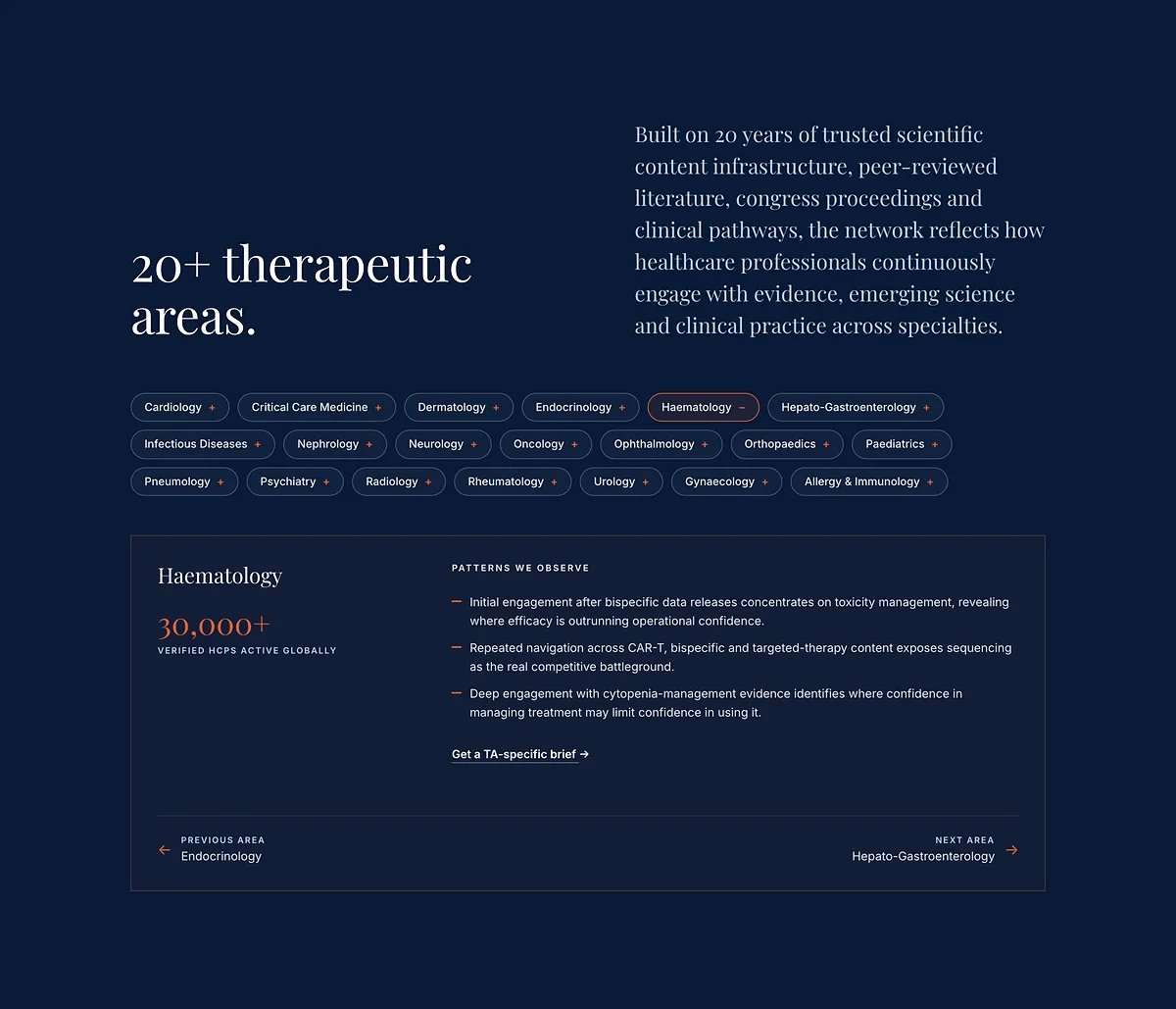
Twenty pills, one panel, and content that comes from the database.
Four languages, one switch.
Launching in English without giving up the other three.
English, French, Spanish, Japanese: all four versions were built together, then the group chose to open in English alone and keep the others warm, ready to publish. The language switcher is waiting in the template, commented out, one line away.
The site runs in its own containers — web server, PHP, database — behind the group’s proxy. Switched over on 4 August 2026, with no downtime and no holding page. It has been living since: feedback from the scientific team, figures revised, areas renamed. That is the sign it became their tool and stopped being my delivery.
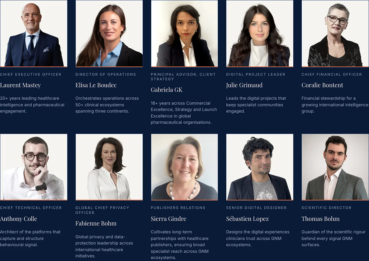
Those portraits went through three rounds of treatment. The last call was the client’s.
A corporate site isn’t judged on its page count. It’s judged the day the team publishes a new idea on it without calling me.
Project note, August 2026